overlapped: lianhua primary school
Year: 2020 - 2021
Size: 35,000 m2
Type: educational
Status: schematic design
Location: Shenzhen, Guangdong, China
Client: Shenzhen Futian Educational Bureau
Partners in charge: Chen Chen, Nicola Saladino
Design team: Shoutuo Lyu, Marco Navarro, Yiren Wang, Javier Pelaez, Peng Nie, Ziyao Zhang
General
layout and massing strategy
The
competition brief for Lianhua Primary School asked to quadruple the size of the
existing school, which stands in the middle of Lianhua Sancui neighborhood,
surrounded by dense housing slabs. The challenge of expanding the current 9,300
m2 to 35,400 m2 in a site that is less than 10,000 m2
was made even more difficult by the requirement of a 150m running track.
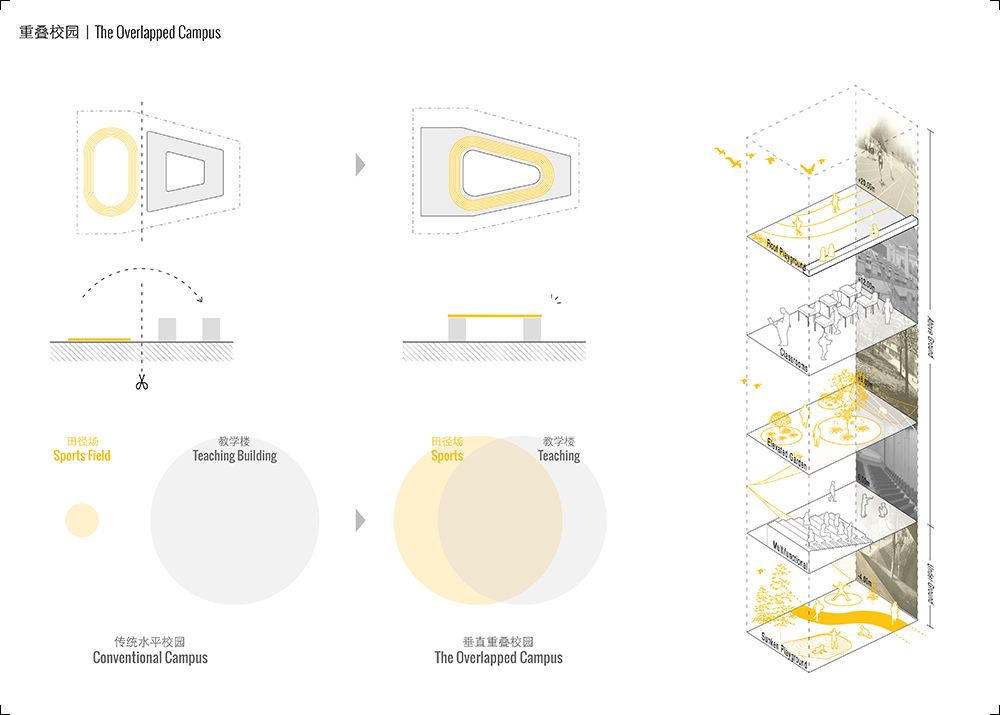
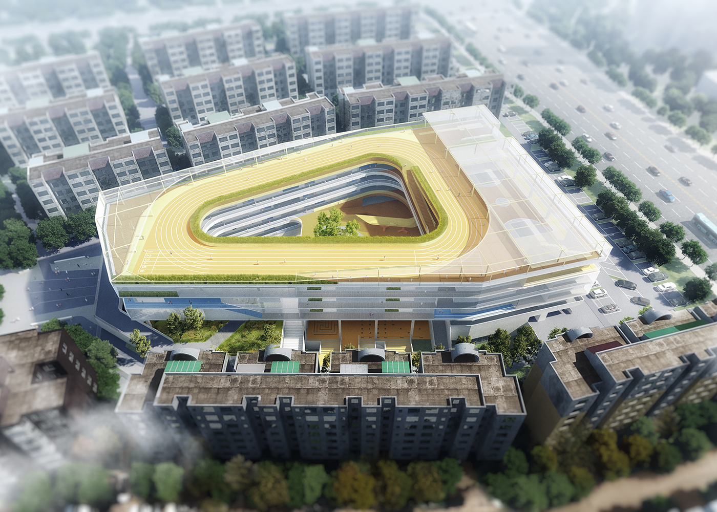
As
a starting point we tested different spatial configurations for the running
track: A) on the ground, beside the school building; B) on top of a podium,
with part of the public program underneath; C) embedded in the volume of the
school; D) on the roof. The latter solution gave us better results in terms of
balancing the spatial quality of the outdoor spaces with the requirements of
fire regulations and obtaining a more efficient internal circulation.
Moving
away from the conventional two-dimensional zoning strategy of Chinese schools,
we explored the concept of “the overlapped campus”, vertically layering all the
different functional zones in a richer and more complex layout that better
responds to the extreme density of the site. In this way, no classroom in the
school is farther than 2 floors from a large outdoor sports area and during the
10min break between classes students have access to a variety of outdoor spaces
that would not fit in conventional school floor plans.
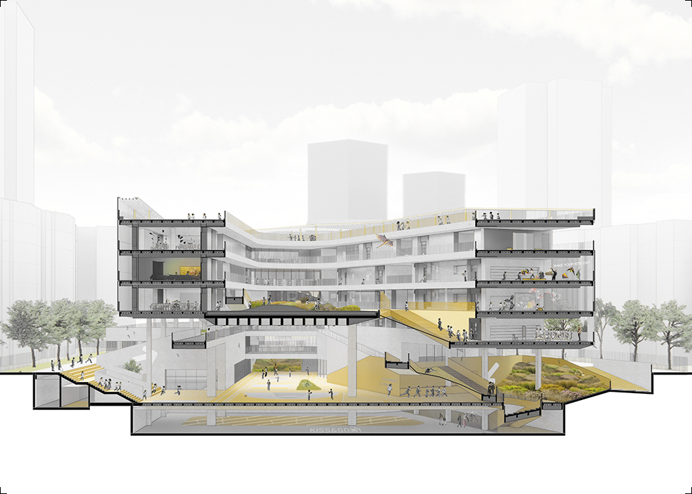
The
form-finding process of the overlapped campus followed these steps: 1) occupy
the largest site area that fulfills both solar and setback regulations; 2)
place the running track on the roof, forming a 14m-deep tulou-like courtyard
structure; 3) elevate the building to provide maximum accessibility to the
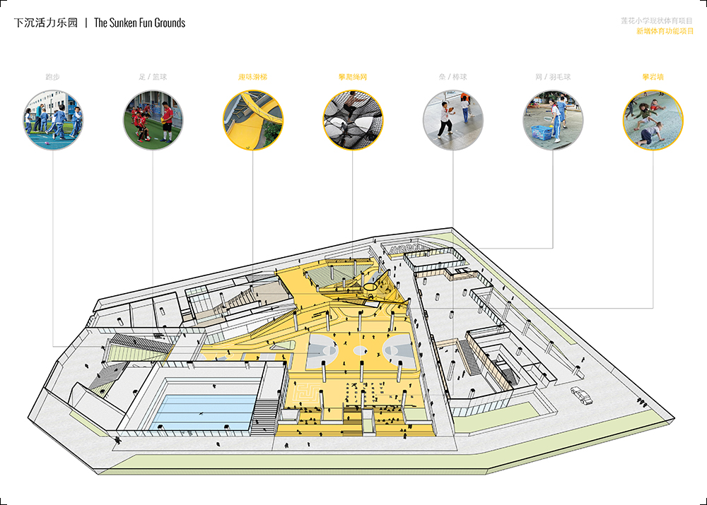
inner courtyard, which becomes an active plaza for open-air activities; 4) sink
the courtyard one level to provide more intimacy and noise protection for the neighbors,
while the permeable ground floor still grants good conditions of sunlight and
ventilation. 5) insert a series of sloped lawns and grades that extend from the
sunken garden upwards to activate the whole perimeter of the ground floor.
The
more public programs are located on the East side in order to allow for the
possibility of sharing facilities with the neighboring community, offering a
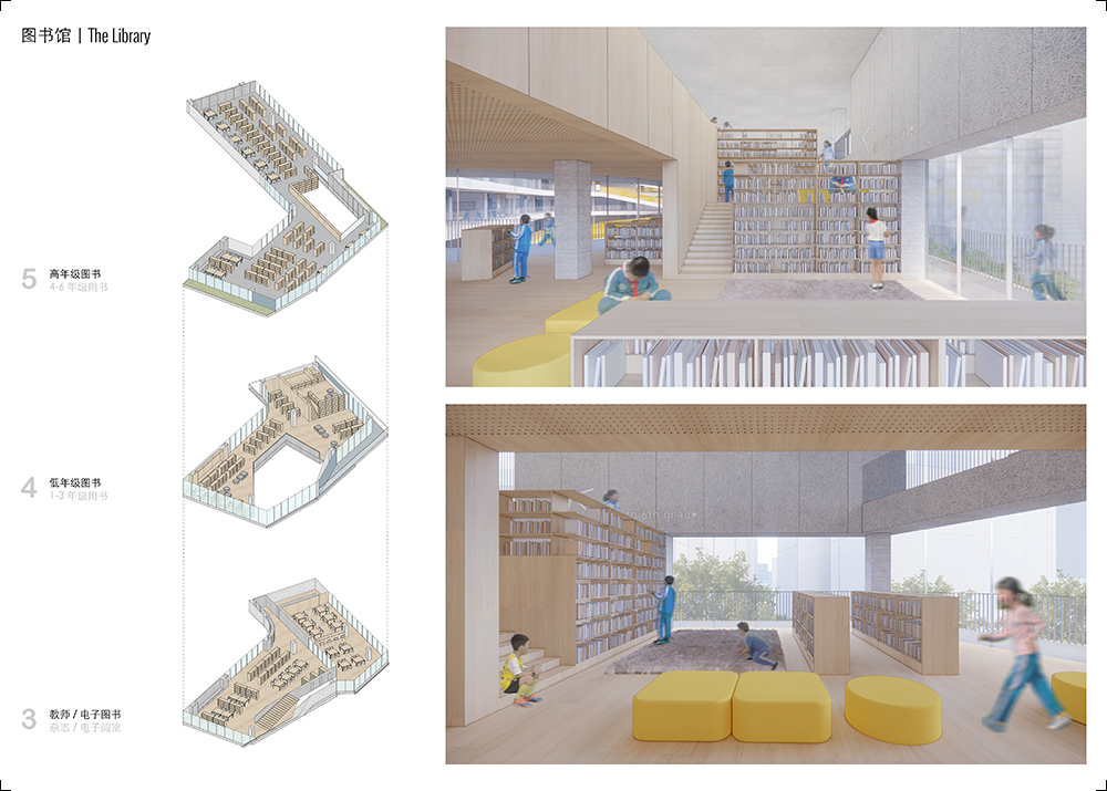
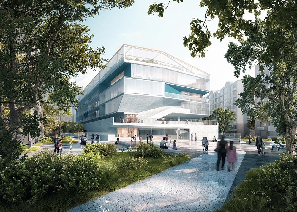
more open interface with its garden. The library becomes the main façade and
its articulated and dynamic volumes render the school as a landmark for the
neighborhood.
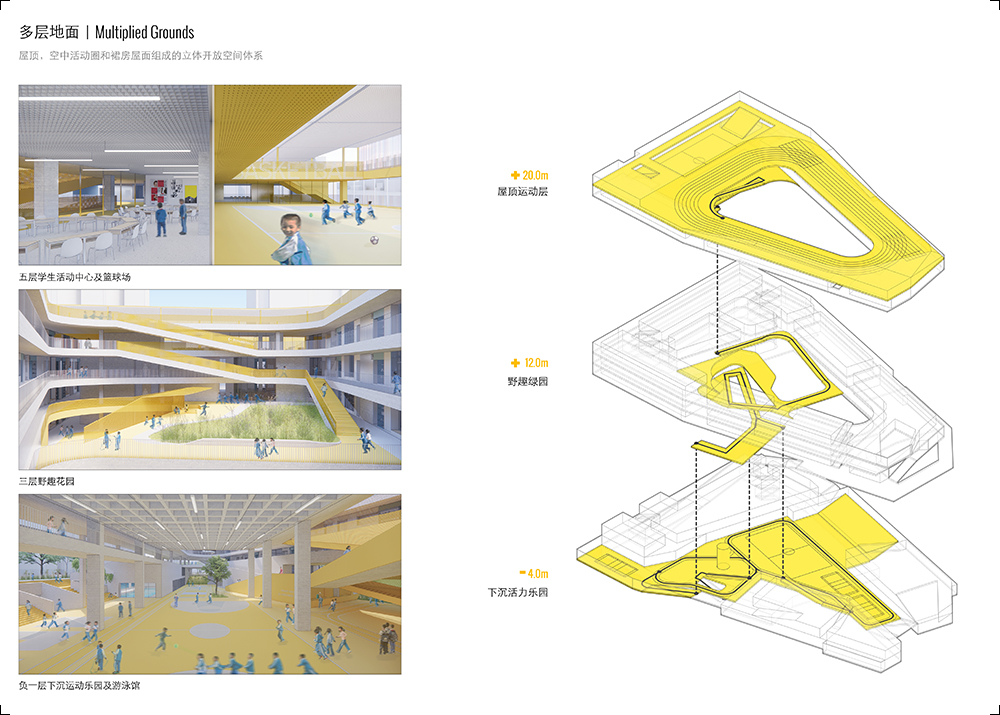
With
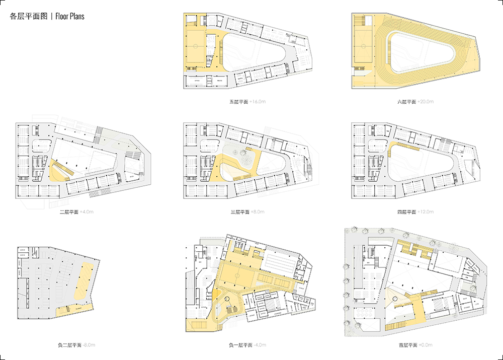
a dense massing strategy the entire program fits in only 5 floors above ground,
minimizing the vertical circulation, which is always a critical limitation for
primary school design. Besides the standard cores that fulfill all the
requirements for fire safety, we added a power link: a more sculptural system
of stairs, ramps and nets that creates a direct connection between the sky
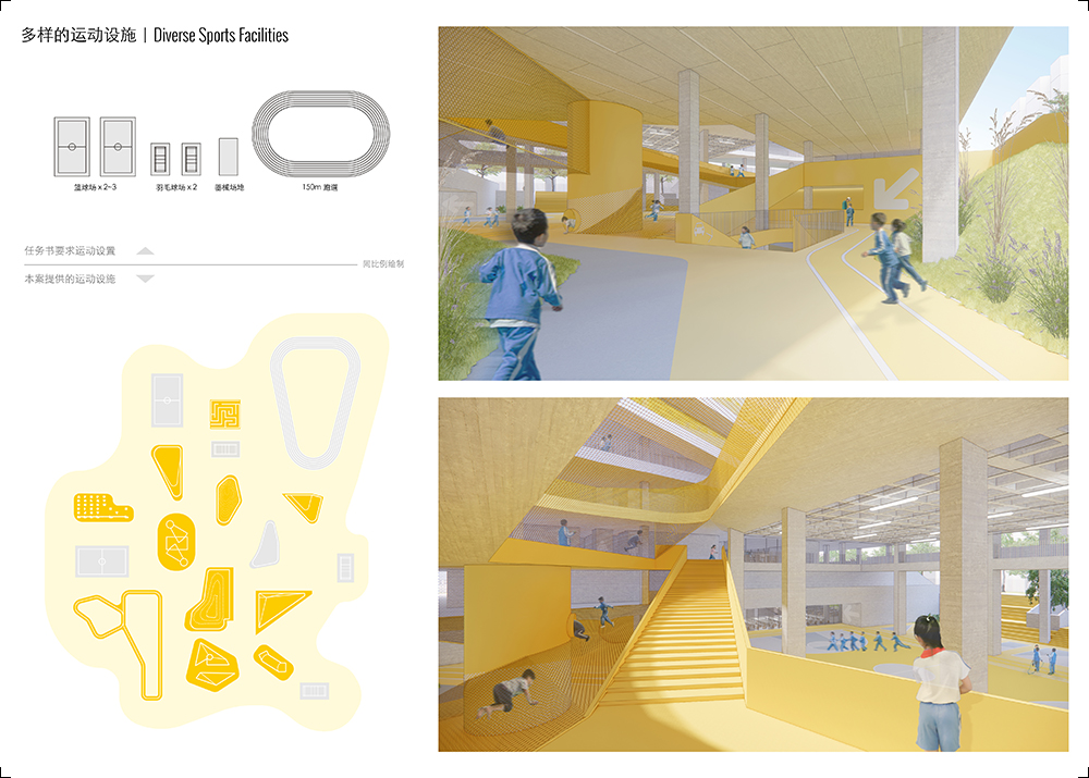
track and the sunken plaza, with a strong visual presence and a series of fun
embedded functional elements that help activate the internal courtyard.
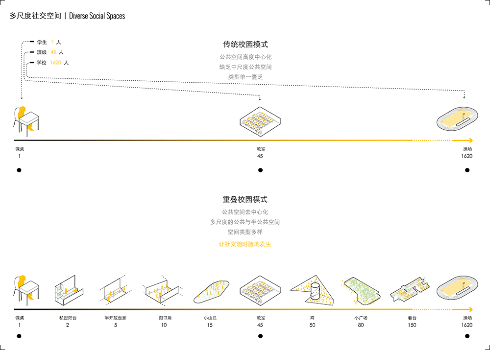
Conventional
Chinese schools usually lack medium-scale spaces: students are either occupied
in individual activities at their desk or involved in large group gatherings such
as the flag ceremony or the daily physical exercises. In the overlapped campus
we designed a variety of multifunctional spaces of various scales that promote
social interaction: balconies, resting areas in the corridors, book corners,
informal discussion zones, small playgrounds, etc. Rather than providing only
formal sport facilities, as required by regulations, we designed a lot more
informal surfaces where kids can engage in all sort of games and appropriate
the space following their own agenda.
Design
solutions
The
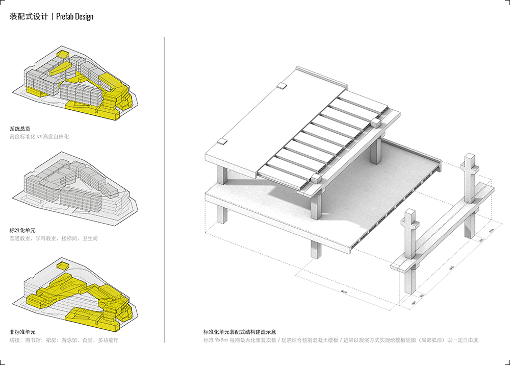
design brief asked for a high level of prefabrication in order to make the
future construction process as fast as possible and minimize the negative
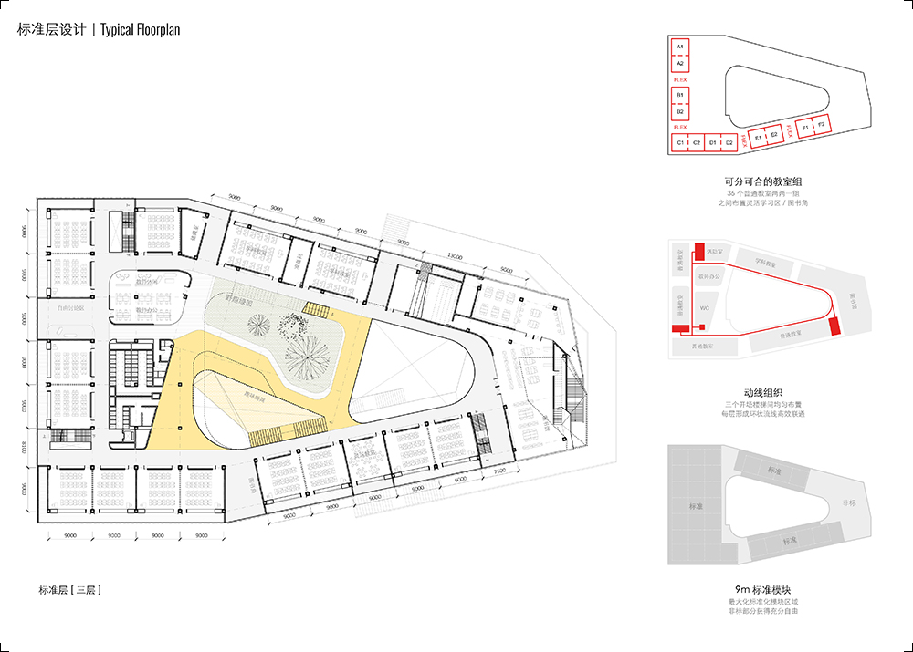
environmental impact on the neighbors. The building structure is organized
through a combination of a regular grid of 9x9m with a series of flexible
casted bends that allow the rigid prefab modules to adapt to the irregular
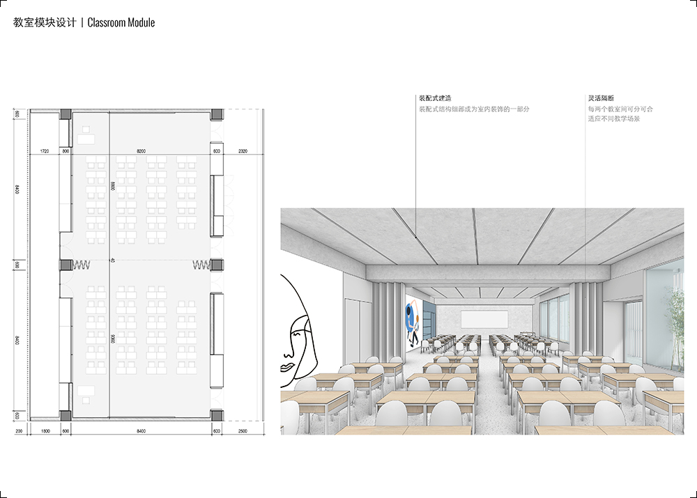
geometry of the site. Every floor contains 12 standard classrooms that are laid
out in pairs, divided by a flexible partition that can be opened or closed
based on different teaching scenarios. Between these pairs, a series of
informal, semi-outdoor spaces like reading corners and discussion zones are
inserted to make the corridors less repetitive and bring more sunlight and
ventilation to the courtyard.
The
inner façade is designed as a modular furniture system that integrates the
vertical shafts for drainage and fire hydrants with functional elements
required by the school: exhibition areas for drawings and models, announcement
boards, bookshelves, benches, drinking points, etc. In this way the corridor is
transformed from a mere functional element for circulation into a more active
public space.
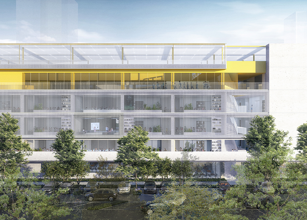
Every
classroom has its own balcony, which offers perhaps the most intimate spatial
experience in the school. Taking care of watering plants and feeding animals is
also a way for the children to learn how to face responsibilities and sharing
such effort contributes to create a sense of belonging to the community of the
class. Outside the balconies a system of thin vertical louvers creates a
coherent envelope that responds to both the solar protection from East and West
sunlight and the need for more privacy in the South and North facades,
filtering the views towards the incumbent neighboring housing slabs.
场地布置与体型策略
莲花小学位于莲花三村住宅小区内,南北两侧住宅紧逼场地,密不透风。场地面积为9964平方米,未来校舍建筑面积将扩充为35379平方米,为原先9300平方米的近四倍,且需维持150m田径场的配置——这是福田中心区又一个极巨挑战的高密度校园。
高密度校园中迫切需要回答的第一个问题,即田径场的布置策略。我们尝试了四种截然不同的布局策略:A运动场位于地面,B位于裙房屋面,C位于中间层屋面,D位于顶层屋面。策略D中的屋面跑道可以充分适应地段的形态,塑造尺度宜人的校园内部空间,也会形成高效的环状建筑平面。
因而我们坚决的摒弃了传统的水平分区式校园,而拥抱了更能充分释放场地空间的高密度垂直分区式校园——重叠校园。在垂直向度上,运动和教学区域彼此重叠,互不干扰。多层地面的开放空间策略,高效利用各层屋面及下沉空间,最大化孩子们与自然的接触,并提高户外空间的可达性与丰富性。任何一个教室都可以在两层之内,找到一个大型户外活动场地。短暂的课间活动时间,孩子们不仅可以快速到达户外空间开展活动,还获得了空前丰富的选择。
重叠校园的形成通过如下的几个关键步骤:1、在满足退距和日照的情况下最大化建筑轮廓,以争取尽量大的校园内部空间;2、170m跑道及篮球场置于屋面,以14m进深体量围合内院,形成一个土楼式的围合型集体生活空间;3、首层架空,增进中央庭院空间的可达性与通透性;4、地面下挖,形成第二运动地面,四周设置边坡以增进通风采光及与地表的联系,同时将对邻里的噪音干扰降至最低;5、一系列草坡、看台等将下沉活动与首层的外部空间衔接并激活。重叠校园,外由周边高密度住区围剿而成,内由环形运动场塑造。它是莲花小学内部功能,和莲花三村小区外部环境两者互动并挤压脱模而成的独特产物。
体育及图书馆等公共设施靠东布置,方便与社区分时共享。图书馆是整个校园最为活跃的立面,它形成了对整个社区与城市的面貌,强调学校在社区中,作为知识中心的存在。我们对社区广场的动线梳理和景观营造,也希望给予周边环境一次整体提升,使得学校更好的融入社区。
除屋顶的田径场外,下沉活动层结合食堂、多功能厅、风雨操场等公共设施,形成一个相对独立的公共地面。而中间的二层至五层之间则是一般教学区和图书馆。全部室内空间在五层以内解决,以最小化校园竖向交通量。一系列连续的楼梯、坡道及绳网乐园等充满童趣的竖向交通,形成了一天一地两个运动地面之间的快速联络,也同时使得这个土楼式的空间内部别有洞天。
传统中国校园往往缺乏中间尺度的公共空间,教室中安静听讲的个人体验,以及升旗、课间操等巨大的集体活动空间,个人与集体的两个极端之间,几乎没有其他特意营造的社交空间。我们提供的多层级社交空间(每层的图书角,空中绿洲等),让孩子们的玩耍、学习、社交、自然探索,可以随时随地的发生。我们努力提供更多多样的非标场地,而非简单满足规范对运动场的刻板要求,使得更多孩子可以参与到运动中来。新的学校类型,虽然没有提供令人熟悉的传统对称式田径场,却提供了两处超过150m的性格迥异的跑道选择,以及数十处充满新鲜感,多样性的运动和游乐设施,每个孩子都可以找到属于自己的那个秘密角落。
建筑解决方案
敏感的场地要求实现高质量快速建造,因而项目对装配化程度要求颇高,而学校建筑类型的功能丰富性使得装配式实施颇具挑战。我们提出 “让标准更标准,让非标更自由”的策略:9m见方的轴网组织了标准层的大部分区域,每层共有18个标准模块,其中的12个以两两成组的方式布置普通教室;而无法被标准化设计的大空间则体现出最大化的自由度和丰富性,成为校园中与众不同、引人注目的空间节点。教室组间布置灵活教室、非正式讨论、图书角等缓冲区域,打破教室连续线性排列的重复感。
教学楼内走廊利用结构和开门的厚度,置入一系列1625(w)x3100(h)的家具模块。五种不同的功能模块分别考虑了小学校园走廊对复合功能的特别需求:书架,宣传栏,展示柜,休息座椅,饮水点;以及一系列技术需求:消火栓,排水管井等。这些可被高度标准化预制化的集成模块,通过穿插组合,使得走廊不再是线性重复的单一功能空间,而是富有活力,激发学生课外学习交流的复合功能空间。
每个教室都设有班级阳台,在高密度的校园中,每个班级的学生都可以营造自己的一个小花园。经营迷你农场,照料小动物和植物,将帮助塑造学生的责任感和班级集体归属感。阳台外侧,东西立面将遮阳作为首要目标,采用尺寸较大的金属百叶,防止各层教学空间及操场层东西晒问题;南北立面则采用不锈钢缆绳,作为藤类攀爬,视觉过滤的半透屏障。使学生在住宅包围、拥挤凌乱的城市环境中,获得一个适合专注的心理距离。

