HKUST(GZ) red bird maker space
Year: 2022
Size: 9,000 m2
Type: educational
Status: completed
Location: Guangzhou, Guangdong, China
Client: Hong Kong University of Science and Technology
Partner in charge: Nicola Saladino
Team: Nuofan Xu, Javier Pelaez, Yuhan Feng
Contractor: China Railway First Group

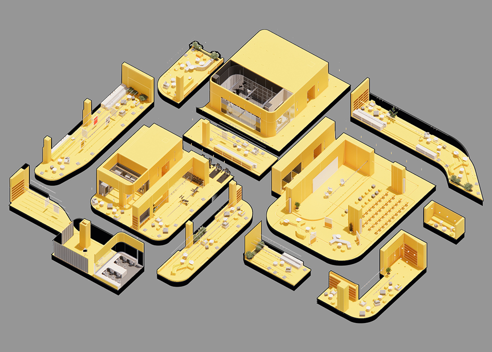
The Red Bird Maker Space is the core of a new multi-disciplinary approach to engineering education. During two years, students from different programs work in teams of five to develop a prototype that combines their expertise, gaining a holistic experience of the design and product development process. In the vision of the faculty, this innovative educational model had to be matched with an environment that inspires creativity and favors debates within the team and exchanges across different research groups. The project consists of multiple spaces distributed in different buildings of the new HKUST(GZ) campus, with a program that comprises design studios (7,400 m2 on three floors), fabrication labs (800 m2) and the high bay (950 m2), the most prominent space designed to host testing sessions for prototypes, exhibitions and public events. Each part is defined by its programmatic requirements but they all share the same design language resulting into an interconnected constellation of spaces disseminated across the campus.
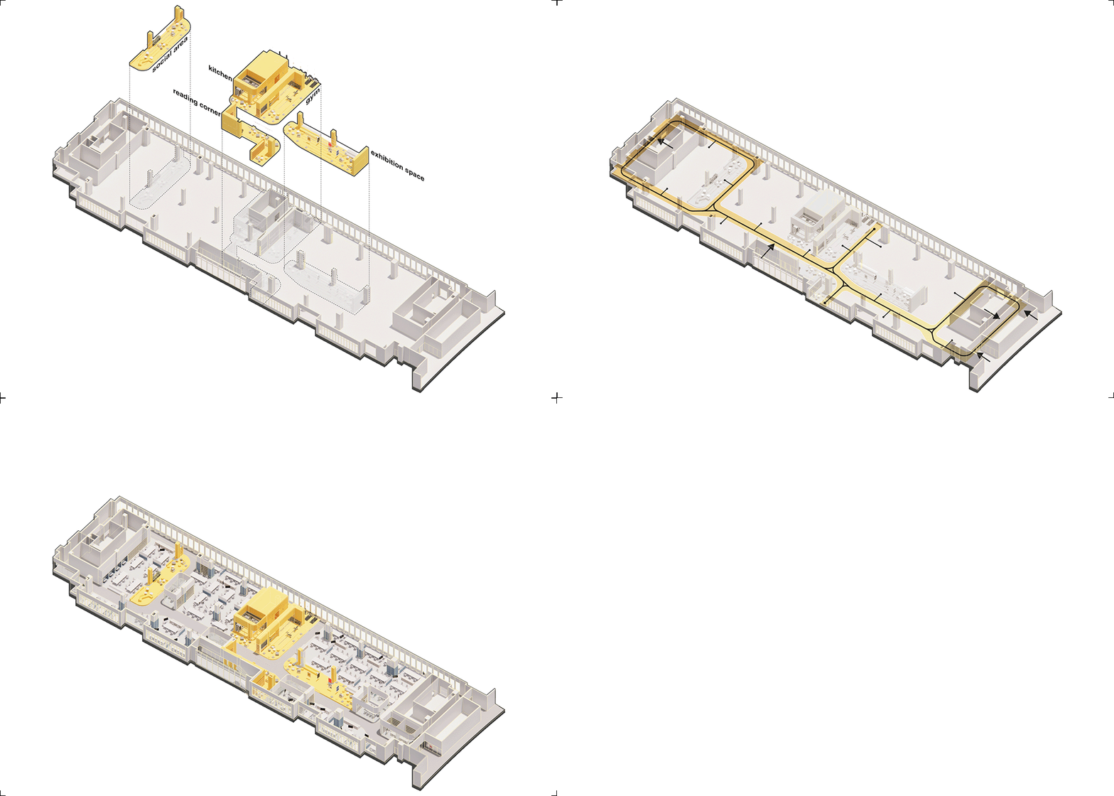
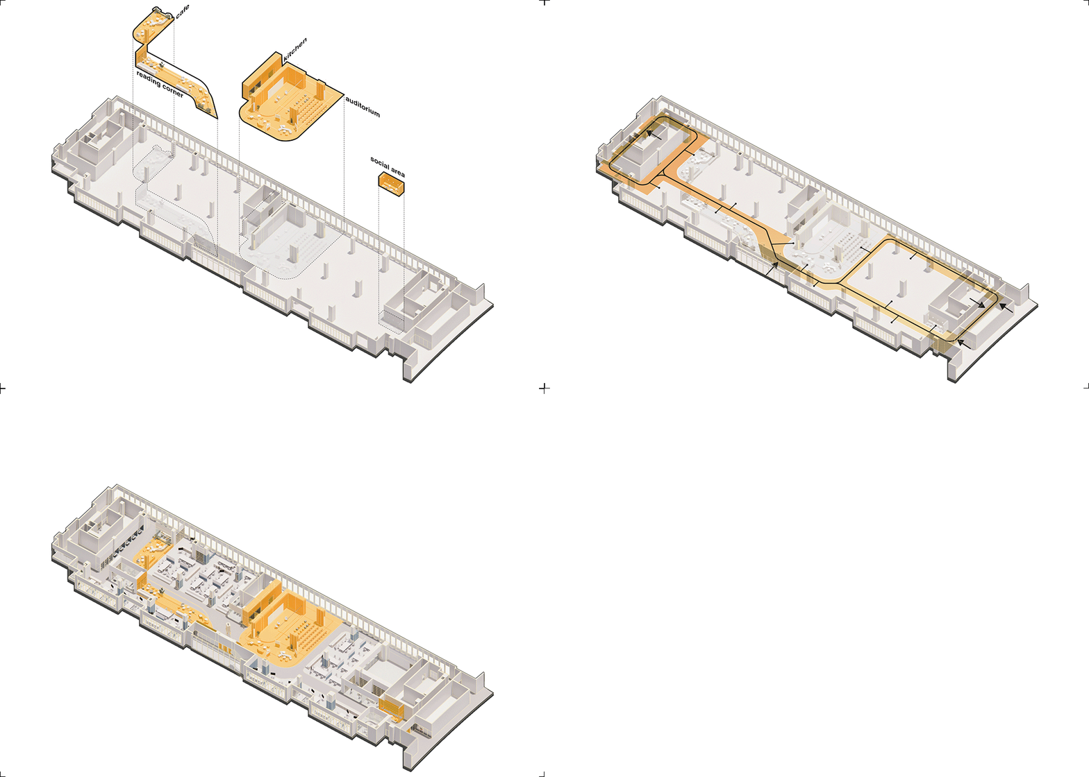
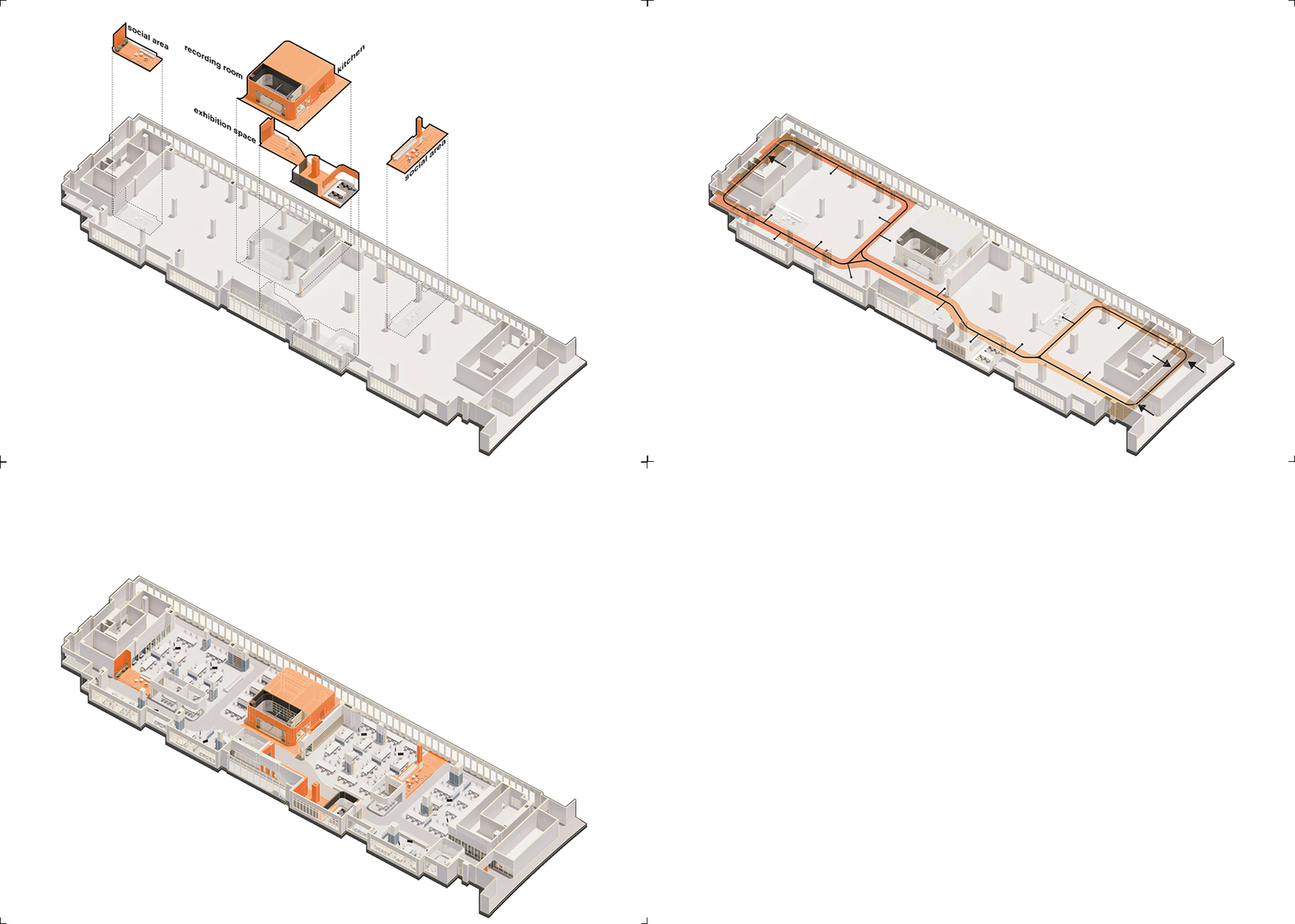
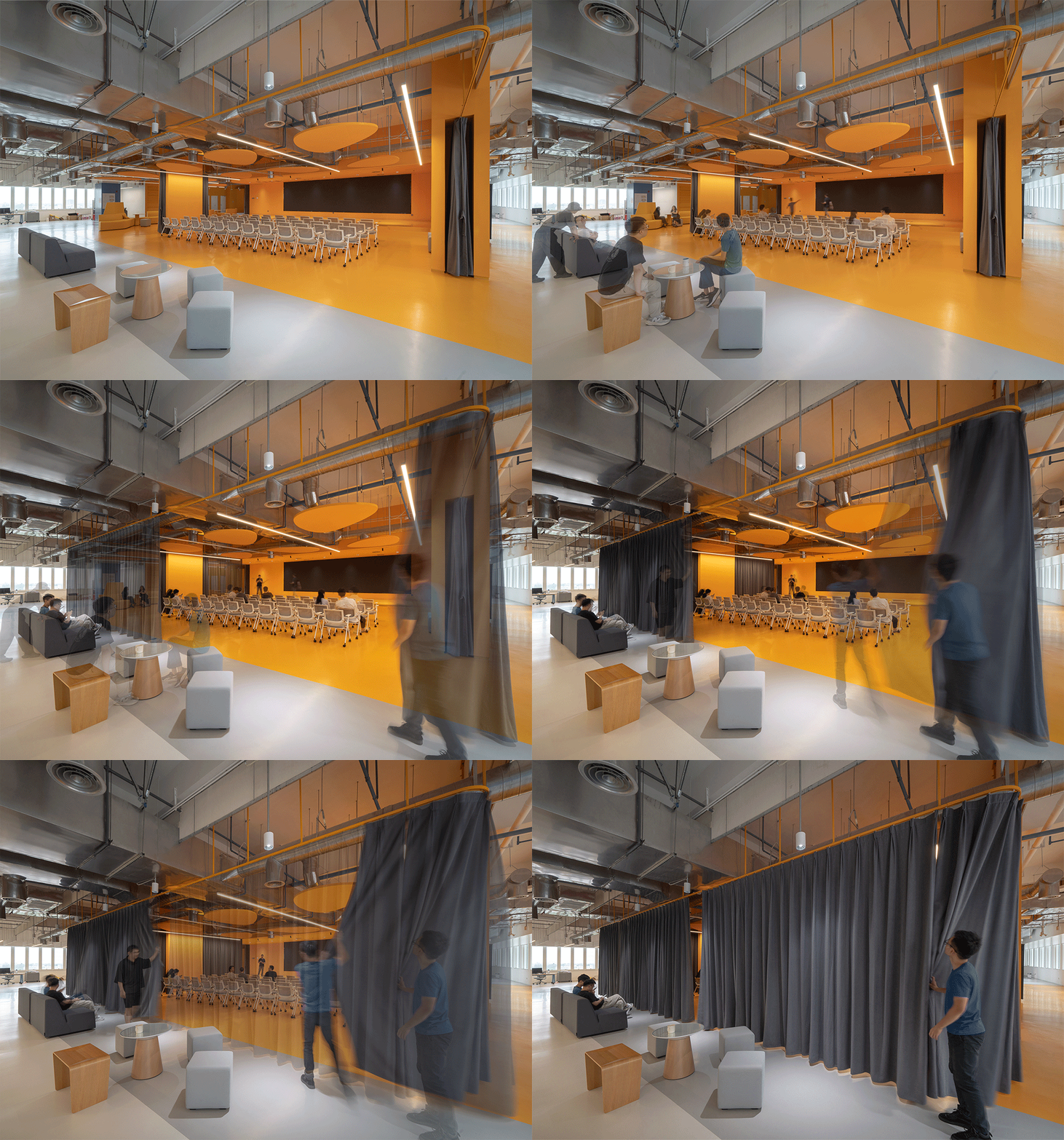
The three floors of studios had difficult conditions to work with: the lab areas were constricted by rigid partitions and surrounded by monotonous perimetral corridors, the headroom was reduced by over-sized HVAC pipes and the natural lighting in the center was really poor. Our design strategy aimed at minimizing the number of walls to create a more flexible floor plan, creating a full catalogue of partition types that respond to different levels of privacy. Rather than relying only on physical barriers, we created subtle differentiations through the use of drop ceilings, raised platforms and material changes, resulting in a space that is at the same time very flexible, but never generic. We broke down the long corridors into smaller segments with a fluid circulation that maximizes visual connections between different areas, we varied the corridor width and activated the wider segments with public programs that work as nodes to organize the working space around them. We minimized the use of false ceiling to expand the floor height elsewhere and we wrapped the insulation layer of the air ducts with stainless steel to leave the pipes exposed, creating a machinic aesthetic that perfectly matches the nature of the program.
Each design team is assigned a set of furniture and tools that can be assembled in multiple configurations to allow different types of group activities and discussions as well as individual work; telescopic sockets hang from the ceiling to create a grid of electric plug-in points that can disappear when not in use, granting the maximum flexibility. Glazed rooms scattered across the floor allow students to have a quieter environment for formal presentations, while a series of niches and booths create the conditions for one-to-one conversations or individual work with stricter sound proofing.
Each floor is characterized by a series of public nodes that create a unique combination of programs across the three floors: resting, reading and dining areas, exhibition spaces, a gym, a cafeteria, an auditorium, audio and video recording studios provide a wide range of support functions to make the workspace fully polyfunctional. Finally in the metaverse classroom a system of motion cameras captures the movements of up to forty students and allows them to interact through augmented or virtual reality with another group of students in the main Hong Kong campus.
While the studios are designed as spaces to exchange ideas during the design process, four fabrication labs provide all the facilities for the construction of the prototypes. The functional program comprises a wood shop, a heavy machinery workshop, a chemical lab and a precision lab. They are all placed in the ground floor and have a generous floor height. The four spaces have very different technical requirements but they all share a spatial organization based on various functional zones organized around a mezzanine, from where the teacher in charge can supervise all the activities.
The high bay is the most public and visible part of the Maker Space. Extending over two floors around a large double-height space, the High Bay offers an area big enough to test all sorts of prototypes from self-driving vehicles, to submarine robots and drones. It is also the perfect location to host public programs and exhibitions, thus a system of screens works as a flexible canvas to support all sorts of different audio-visual content. The original space had difficult proportions to work with: the central double-height area was very long and relatively narrow and the interaction with the second floor was reduced to a linear balcony that had limited connections with the rest of the building. The richness of the functional program allowed us to divide the linear space into multiple interconnected zones with more controlled geometry: from a glazed pool to a net for drones and a track for vehicles. We expanded the balcony with a large stair that stiches together the two levels and works as a sitting area overlooking the central atrium, providing space for public lectures and informal gatherings. While the stairs break the strong symmetry of the double-height space creating a much more dynamic configuration, a long aluminum cabinet develops into a system of display shelves, storage cabinets, sitting areas and work benches, transforming the long, arched wall at the back into the support for any type of exhibition format. On the second floor, two work zones offer tools and free space to assemble the prototypes, while the long corridor between them is transformed into a resting area to observe all the activities of the central atrium from above and host students’ discussion groups.
红鸟创客空间是香港科技大学(广州校区)不同工科交叉融合、强调共享创造教育理念的核心载体:在两年的时间里,不同专业的学生,组成五人的团队,结合专业特长,深入学习设计和产品的研发。校方认为,这种创新的教育模式,需要具备能够激发创造力、方便交流的学习场所。由多个部分组成的红鸟创客空间,分布在新校园的不同建筑中:多功能studio(W1 Labs,三层共7400㎡)、创客实验室(Maker Space,800㎡)和展示厅(High Bay,950㎡)。尽管它们功能各异,但我们试图利用统一的设计语言,使它们形成一个相互连接的空间群落。
改造前的studio建筑空间存在诸多挑战:非黑即白的功能分区隔断;位于建筑边界功能单一的狭长走廊;被巨大的暖通管道压低的室内净高;空间的自然光环境也不尽如人意。应对以上现状,我们提出了鲜明的设计策略:尽量减少固定隔断,创造更为灵活的开放平面;设计出更为丰富的空间分区,为不同开放程度的活动创造条件。我们利用天花吊顶、高差和材质的变化,营造出灵活多样的学习空间;将狭长连贯的走廊化整为零,实现不同区域之间的视觉联系;单一的走廊宽度也被打破,植入的公共空间串联起不同类型的学习区域。为了扩大空间净高,原有的天花吊顶被拆除。暴露出来的空调管道,采用不锈钢保温层包裹,呈现出特有的机械美感。
Studio配置有多样的家具和空间模块,以便开展不同类型的小组活动。从天花垂吊下来的伸缩式插座,不使用时可以直接“消失”。相对独立的玻璃隔间,提供了安静的演示和讨论场所。私密的卡座,为一对一的交流和独自一人的学习场景创造了条件。
每一层空间里,一系列不同的公共节点,创造出独特的空间体验。休息室、餐厅、展厅、健身房、咖啡厅、演讲厅、录音室等,提供了丰富的空间活动日常。此外,在元宇宙教室,运动摄像机系统结合虚拟现实技术,使得教室内上课的学生,可以与香港主校区的教学实现无缝连接。
相比于注重讨论交流的studio,创客实验室更强调动手的实验操作。创客实验室空间包括一个木工坊、 一个重型机械车间、一个化学实验室和一个精密实验室。位于首层的四个实验室,有着不同的空间技术要求。净高充裕的它们,附有夹层,负责的课程老师,在上层工作室仍能非常方便地总览和指导学生们操作实验。
High bay是整个红鸟创客空间里最开放、最突出的场所。两层通高的High bay,提供了足够宽敞与自由的场地,满足诸如无人驾驶、潜艇机器人、无人机等测试需求。同时,High Bay也是举办活动和展示的理想空间。室内的屏幕系统,可以作为灵活的“画布”,播放不同的视听内容。改造前的High Bay,室内条件非常受限:原有的空间过长,相对狭窄;一楼与二楼之间,只有狭长的平台连接。我们将中心空间分解为相互连接的多个不同区域,包括适用于不同实验和展示场景的玻璃水池、无人机网、无人驾驶车道等。从平台延伸而下的大楼梯,既连接起两层的空间,也能作为公开演讲和讨论的开放场所;同时打破了原有空间的强烈对称性,创造出生动的平面布局。拱形墙体上的铝材陈列柜,是由展示架、储物柜、座位组成的复合设施,可以在不同类型的展览活动中使用。二楼的两个工作区域,则为学生们提供了动手组装的场地。工作区域间的狭长走廊,被改造成为公共休息区。身处其中,可以俯瞰首层中庭的场景,指导首层地面的讨论活动。


