cha'er 3: reMIX BJ office
Year: 2015
Size: 240 m2
Type: office
Status: completed
Location: Beijing, China
Client: reMIX studio
Partners in charge: Chen Chen, Federico Ruberto, Nicola Saladino
Design team: Tairan An, Klest Pango
Contractor: Beijing Dongfutianxia
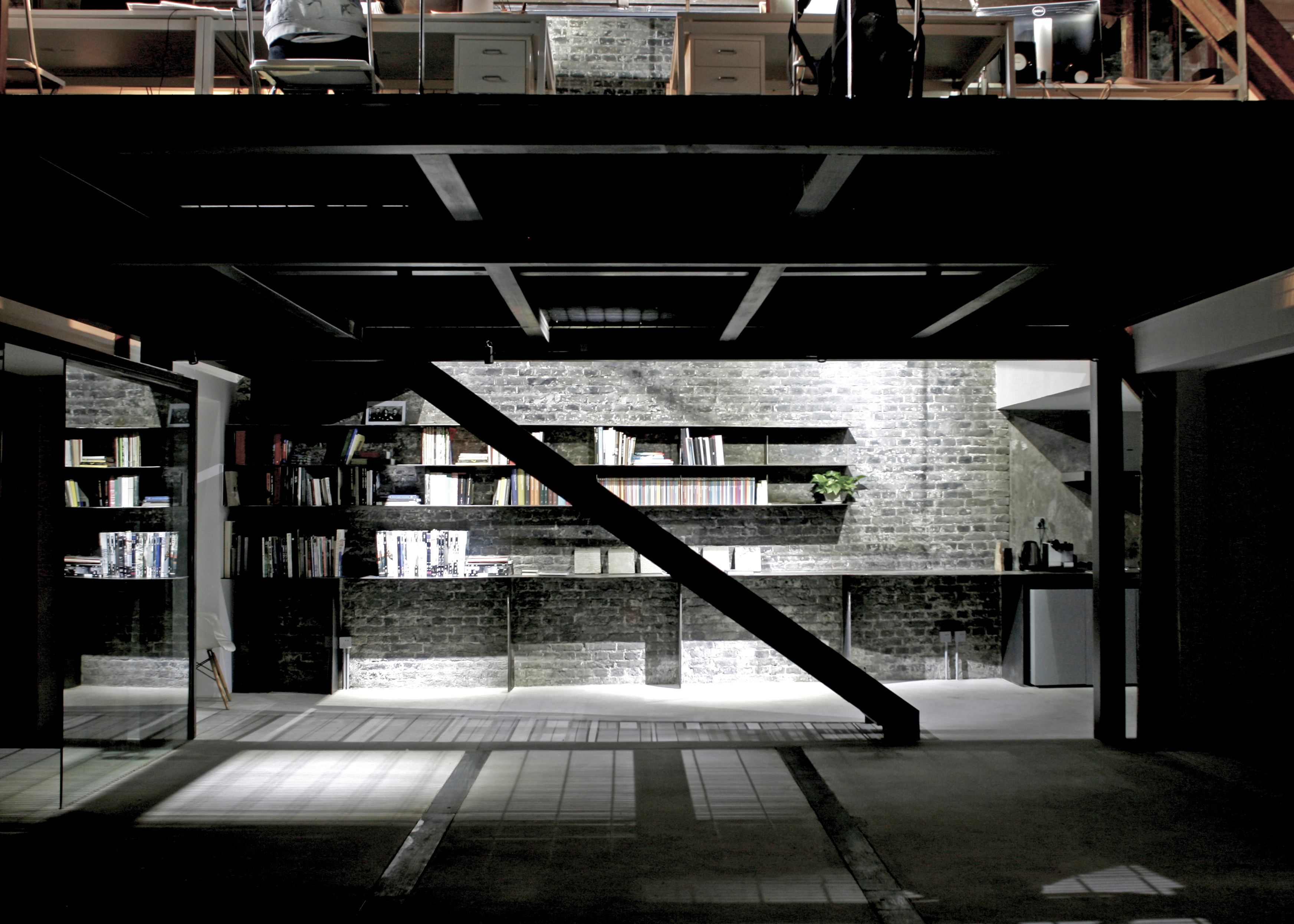
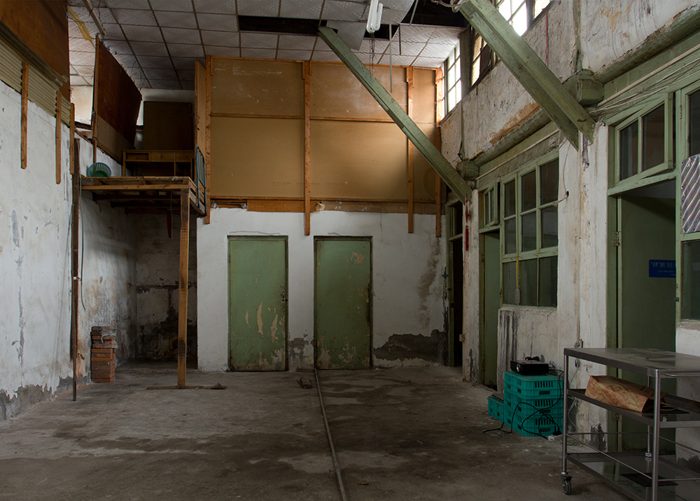
After working in Dashilar on two pilot projects, the local state-owned developer offered us the possibility of renovating a vacant property, transforming it into our design office. The plot had been originally occupied by a courtyard house with two rectangular volumes parallel to the street (N-S orientation), with traditional wooden pitched roofs. In the 1960s/70s, following the period of rapid industrialisation of China that affected also some of the urban fabric inside the hutongs, the courtyard was covered with a high roof, creating a sort of central aisle that would be able to host a workshop or some light industry.
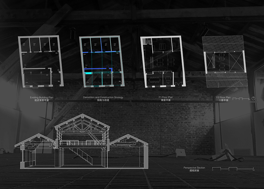
When we started the renovation, the North block still presented its original facade with windows and glazed doors leading into small rooms, while on the South side a series of blind walls negated any relationship between the different spaces. The lower volumes were too fragmented to allow any flexible use and the building was short of ventilation and natural light. We started demolishing all the false ceilings and most of the non-structural walls and carried out an extensive structural survey. In the process we removed the plaster on the lateral brick walls, discovering very interesting textures that were worth exhibiting.
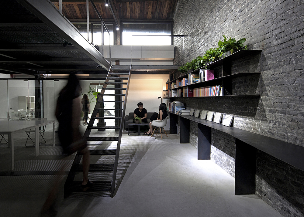
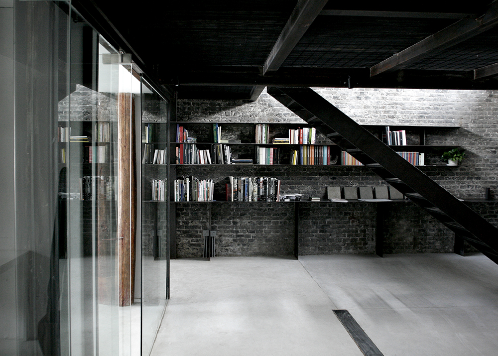
We sanitised all the wooden columns and beams, adding hidden steel reinforcements where necessary, levelled the ground introducing floor-heating, improved the thermal insulation of the roofs using high-density foam panels (between the rafters in the lower volumes and above the wooden panels in the central space) and added a new waterproof layer. The high-walls of the central space, deteriorated by years of rainwater leaks, were completely rebuilt with a new stripe of double-glazed windows. Once we obtained a clean and sound envelope we proceeded with the interior construction, which mainly consisted of a new self-standing metal mezzanine, glazed partitions on the South side and some built-in steel furniture.
The North volume, which doesn’t have any direct source of ventilation and natural light, hosts all the services (toilet, kitchen, storage, model workshop) while the South volume includes a small and a large meeting room. In the central space, the mezzanine allows us to place most of our design activity upstairs while keeping the ground floor as a flexible co-working / exhibition space. The new spatial layout allows a much richer interaction between the different functional areas, creating new visual connections between different levels and across the volumes. In order to operate successfully with a limited budget on a poorly conserved historical building we decided to embrace the irregularities and the mistakes of the original structure, playing with a dialogue between the roughness of the steel and concrete and the smoothness of the white walls and furniture, the warmth of the wooden structure and exposed bricks and the bare simplicity of the frameless glass.
茶儿三号是reMIX在大栅栏更新计划中的第三处四合院改造项目,而这次则是作为我们自己的设计工作室。场地最初是一个由南房、北房院落组成的南北向合院,其房间木构架的形制保留完好。在六七十年代快速工业化的潮流中,一些小型工厂在胡同区域中建立起来,多将院落加顶以最大化室内空间,适应轻工业的空间需求,这里也不例外。原有院落上方由8m高木质屋架覆盖,整个地块形成中间高、两边低三个坡屋面组成的空间序列。
北房内部分成四个小间,其南立面仍保留原先的门窗,而南房的北立面则已被改为一堵实墙。南北房中支离破碎的平面分隔导致自然通风采光的不足,并不允许灵活的室内布局。我们的改造从拆除所有的吊顶及非承重墙开始,并紧接着对清理后的结构进行了新一轮的测绘和勘察。东西侧墙外包裹的石膏层被剥离开来,裸露出斑驳的青砖墙。
我们对建筑表皮的干预是修复性的,并必须严格遵守原先的轮廓。从木材的截面可以清晰分辨出其建造的时期——圆木属于原有结构,而方木则是工厂时期的加建结构,我们最大程度的保留了所有的木结构,并在个别局部采用不同的金属构件加固。此外,在屋面及地面都增加防水和保温层,并安装地暖设施,使用导热性较好的素混凝土地面。原先三个屋顶体量之间所形成的天沟导致其相邻墙面因长年的潮湿完全腐朽,因而亟待重建,并将原有的带状高窗替换为热工性能更好的双层中空玻璃。室内空间的干预则主要包括增加一个具有独立结构的钢结构夹层,南房北面的玻璃隔断和一系列的嵌入式家具。
从功能布局上,缺乏自然通风和采光的北房承载所有的服务功能(卫生间,厨房,储藏和模型车间),阳光充足的南房布置会议室和一个可独立的办公单位,而中间两层通高的空间则作为开放的办公/展览区。夹层是另一个较为独立的办公区,地面的铺装采用金属格栅,既最小化对其下方空间采光通风的影响,又可在灯光下形成具有戏剧性的光影效果。改造后的空间布置不仅使得各功能区域间获得更丰富的视觉交互,也允许了一定的灵活性,为多种场景下的功能布局提供可能。在旧建筑原有结构状况较差而整个工程造价极为有限的情况下,我们有意识的包容和保留各种历史遗留的结构和空间不规则性和“不完美”。从材料上,我们亦试图创造混凝土与钢的“粗糙”质感与白色墙面及家具的“光滑”之间,木结构及青砖墙的“温暖”和玻璃隔断的“纯净”之间的有趣的对比与对话。
